Project Overview
Client: Oxygen Activeplay
Role: Senior In-House Graphic Designer
Project Type: Brand, Hospitality, Print, Packaging, POS, Motion, Art Direction
Objective: Refresh the F&B experience to increase menu engagement, improve upsell opportunities and create a more playful, on-brand café experience.
My Responsibilities:
- POS & large format rollout
- Creative direction
- Menu design
- F&B photoshoot art direction
- Packaging design
- Motion graphics
- Café screen content
The Challenge
The existing café menu system lacked impact in-venue, created friction in customer decision-making and offered limited upsell visibility. The business also needed a more cost-effective production approach while ensuring compliance with calorie display requirements.
Results / Impact
- Improved visibility of high-value meal deals through menu positioning
- Reduced print production costs by moving from Z-fold to laminated A3 format
- Created a consistent visual language across menus, screens, packaging and café POS
- Supported upsell strategy through clearer promotional hierarchy
- Enhanced brand personality and family appeal through playful illustrations and copy
Creative Approach
I wanted the café experience to feel as energetic and playful as the parks themselves. This led to:
- updated, authentic, movement-driven photography
- playful handwritten notes
- child-led visual storytelling
- clearer visual hierarchy for deals and upsells
My Role
I led the creative execution across the café refresh, designing all customer-facing touchpoints from menu systems and POS to packaging, motion graphics and reusable drinkware. I also art directed the food photography to ensure a more playful, authentic brand expression.
The Journey
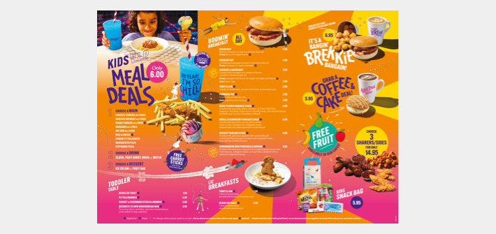
The February 2026 launch of the revised Oxygen Activeplay café menu would see me handle the creative as the in-house designer, and art direct the F&B photoshoot for the business. My vision for the imagery was to give the food and beverages a feel of movement and fun where possible, reflective of the indoor activeplay parks’ offering in keeping kids active and having BIG-TIME FUN!
The menu would feature kids with illustrated elements interacting with the items (pushing over slushies and somersaulting over chicken snack boxes), hand-written illustrated notes and a sprinkling of cheeky wit.
The design I created aims to maintain the look and feel associated with the brand, appealing to kids and adults alike with bold colours, playful typography and photography that’s a real reflection of the items customers would be served… non of your Burger King or McDonalds trickery here!
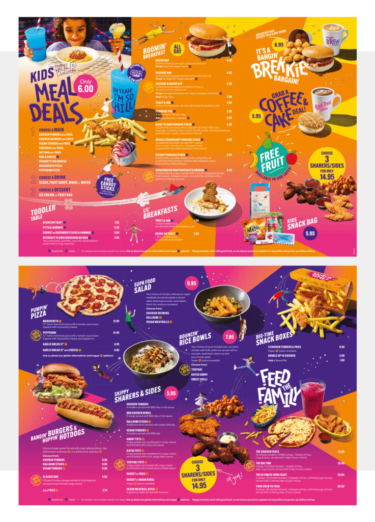
The redesign removed unnecessary cover pages to create a faster, more immediate customer experience… and instead of being like former Z-folded versions, was to remain as a flat A3 laminated sheet, with the idea that it could sit in the table holders and instantly catch the eye even more so than those before it. Not being folded also has the benefit of a reduction in production costs!
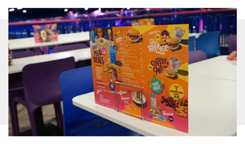
Whichever way around the menu is placed in the holder, the customers’ eyes are instantly drawn to the deals at either end, with the business aiming to improve in upselling to customers.
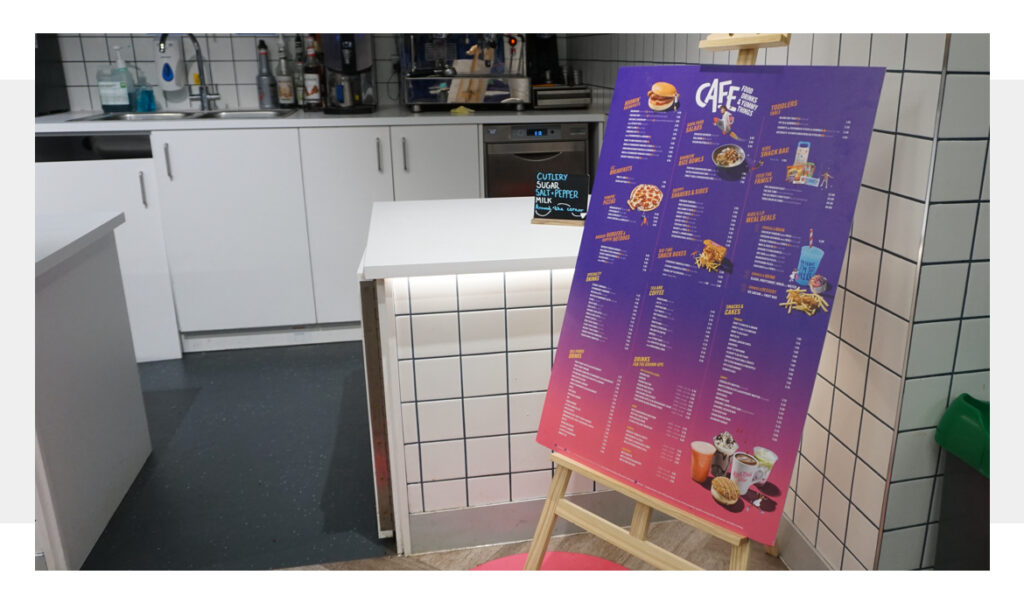
Accompanying café table menus, I would create A1 menu boards to sit on easels, no more than 2 per café and situated near the order desks, which detail the products’ calorie values (which the parks are legally obliged to do) and pricing for other available items such as impulse snacks, hot, chilled and speciality drinks.
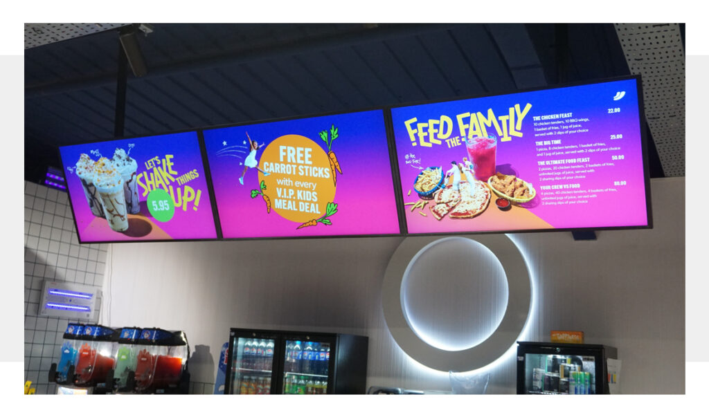
The parks’ café screens would also get an overhaul, where they had previously displayed the whole menu, they would now showcase the deals on offer, again driving those opportunities for customers to trade up whilst also letting them know about some healthy options such as receiving free carrot sticks with meal deals, and the free fruit on offer.
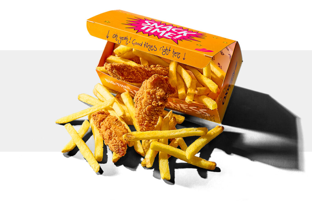
As part of the F&B updates, I created packaging for the chicken and fries snack boxes. As well as being a box to hold the food, I wanted to add in some fun elements with text and illustrations…
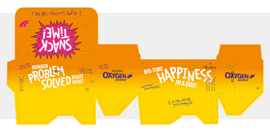
From my own handwriting that says “Oh Yeah! Good times right here” which is revealed on the flap when the box is first opened, to underneath the box that says “If you can read this, you’re probably full”, I wanted to create something that would bring a smile to peoples faces, as the fun shouldn’t stop just because you’re no longer bouncing around on trampolines, or jumping into giant air bags!
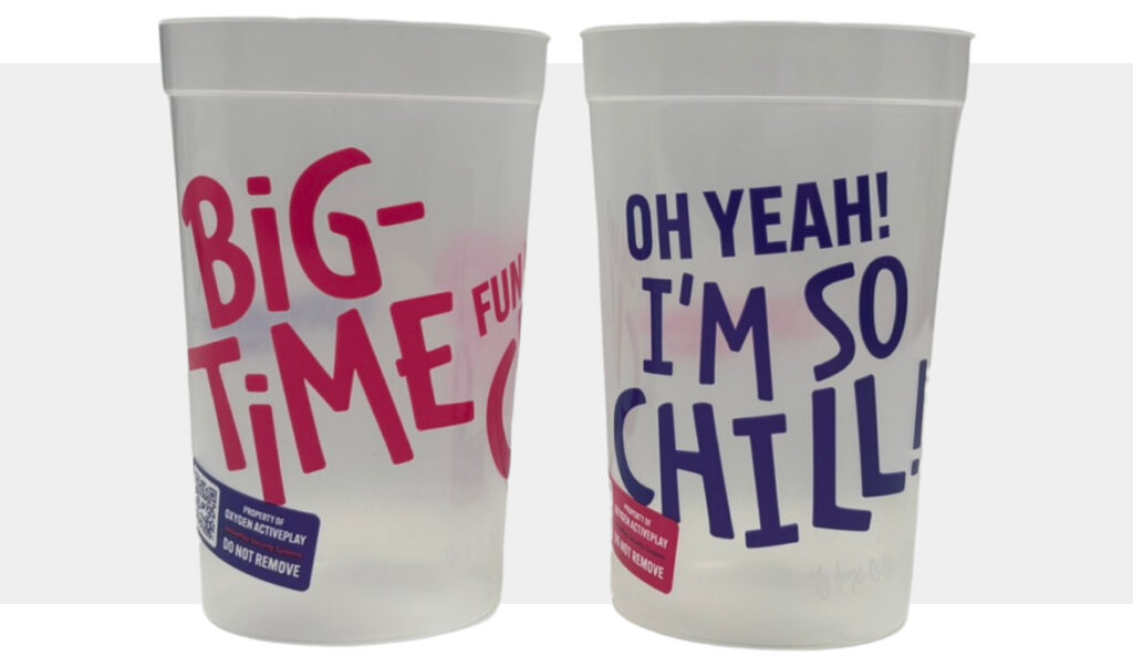
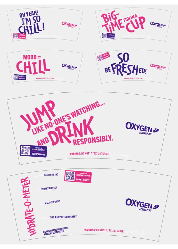
Another element to the parks’ cafés was the introduction of reusable 12oz ‘stadium’ cups for slushies, where I created a range of phrases/designs to be used, printed in purple, pink and white ink and those pictured above; “BIG-TIME FUN in a cup” and “Oh Yeah! I’m So Chill!” chosen as the 2 designs to be applied.
Oxygen’s cafés around the same time had started to introduce self-serve hot drinks machines, featuring screens that could be branded with motion graphics.
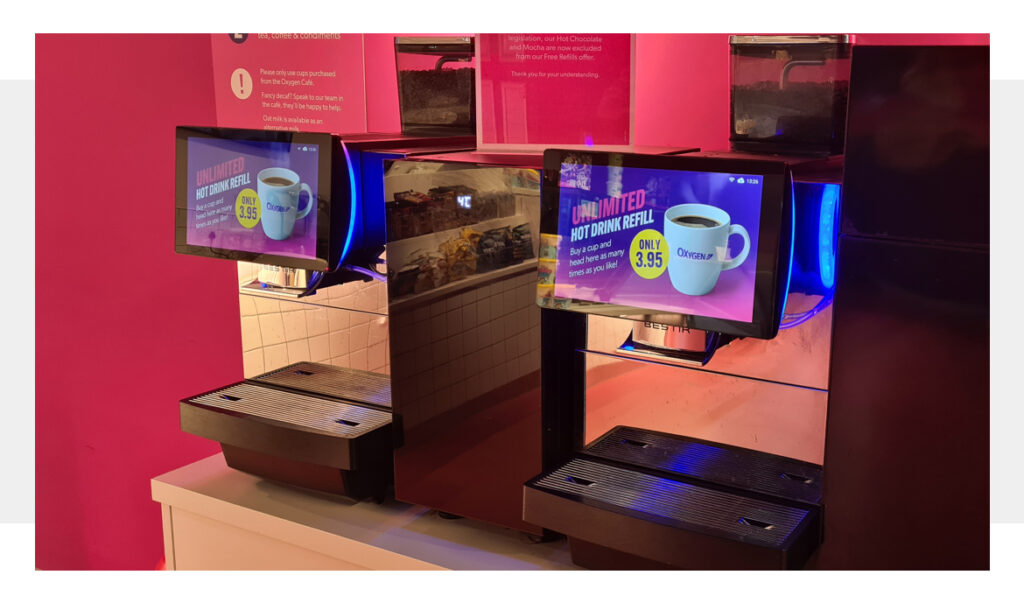
I took the opportunity to create some fun, playful animations to promote the unlimited hot drinks offer, and bring to life the ‘filling screen’ to be used once customers had selected their beverage, they’re commended in making a great choice!
The Result
The creative was rolled out across 13 UK indoor activeplay parks, balancing operational, legal and commercial requirements while maintaining brand consistency. The business would go on to report a 12% uplift in upsell deals in the first 3 months of launch, plus an increase in average spend per customer of 11p. From brief to delivery in parks, the project took 5 weeks including the creation of Ninja Warrior UK branded versions for those 5 locations owned by Oxygen Activeplay.