In order to promote AttractionTicket’s diverse range of attractions, activities and experiences, the concept was to feature at least 2 of these experiences in a fun, vibrant way, aligning with AttractionTicket’s hopes of bringing happiness and excitement to peoples lives.
Not only should the campaign be diverse in terms of the experiences on offer, but also to the people catered for; families, couples, people of all ages… the campaign should be simple, emotive, relatable and of course feature brand elements such as colour, typography and iconography to reinforce brand recognition.
Of the approved headlines below, I have chosen “Taste the highlife… with AttractionTickets.com” for the examples I’ve created.
• Meet your heroes… with AttractionTickets.com
• Face your fears… with AttractionTickets.com
• Reach for the stars… with AttractionTickets.com
• Taste the highlife… with AttractionTickets.com
• Reach new heights… with AttractionTickets.com
• Make new friends… with AttractionTickets.com
• Laugh out loud… with AttractionTickets.com
• Feel the force… with AttractionTickets.com
Any of the headlines lend themselves to a range of supporting imagery for what AttractionTickets offer.
As an example; “Meet your heroes” could feature someone’s daughter meeting Buzz Lightyear at a Disney theme park because she loves anything to do with space travel, and the idea of being an astronaut one day… or a couple experiencing Marco Pierre White’s restaurant, where the husband, an amateur chef has a chance meeting with Marco himself.
“Feel the force” has obvious Star Wars connotations, imagery could feature children engaging in a light sabre battle in front of Disney World’s Galaxy Edge experience, juxtaposed with a family enjoying an adventure swimming pool’s wave machine, or log flume theme park ride with the force of gravity playing its part.
“Taste the highlife” conjures up imagery of those special occasions experiencing the highlife, sipping champagne, luxurious food and intimate settings… coupled with the adrenaline rush at the heights of rollercoasters, views from a ski lift or tranquility of a hot air balloon ride at 2,000 feet up.
“Tasting” the experience alludes to a moment in time, something unique, exciting, fun and special to experience before you have to go back to normality… but will leave a priceless memory that can be treasured for a lifetime.
Taste the High Life imagery inspiration:

Taste the highlife imagery editing
To help reinforce brand recognition in new markets, image editing is important in helping to establish a brand style, if only for the duration of this campaign before it evolves over time, taking people on the journey.
Bringing in the subtle gradient of the AttractionTickets logo was a place to start as a background for the experiences. The cooler tones allowing the main content to pop with an increase in colour saturation, vibrancy and image sharpening.

Logo brand mark front and centre
Coupled with editing the imagery, the logo mark should be front and centre, becoming iconic over time within the leisure and tourism sector in a similar way to the Nike Swoosh or the Apple logo within the sports and tech industries respectively.
The mark is bold, fun, exciting, dynamic and represents everything you would wish to experience when purchasing tickets to attractions and activities through AttractionTickets.com.
Below are initial mock ups for how this might be achieved with various elements coming together:

However, none of these capture the current feel of the brand and look of the website, and are potentially too bold, chaotic and not as professional as they need to be for reassuring trust in the communication.
The AttractionTickets website is clean, clear, with a lot of white space to frame the images and information, which should be replicated in this campaign.
An epic feel! Imagine you’re in a film…
…with everything AttractionTickets has to offer and continual rise of social media platforms used to promote individuals, businesses, events and experiences, it can feel as though we are travelling through our own life as a movie, with its twists and turns, excitement and adventure… all documented with pictures and videos throughout the story.
Films are epic, exciting, fun, unique, cater for all demographics and align nicely with the same values AttractionTickets wants to promote…
Imagine AttractionTickets is a film, promoting the brand in a similar way with movies posters and social content… maybe even an epic trailer further down the line?
Bold, attention-grabbing typography is called for!

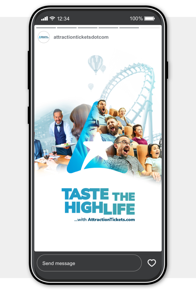
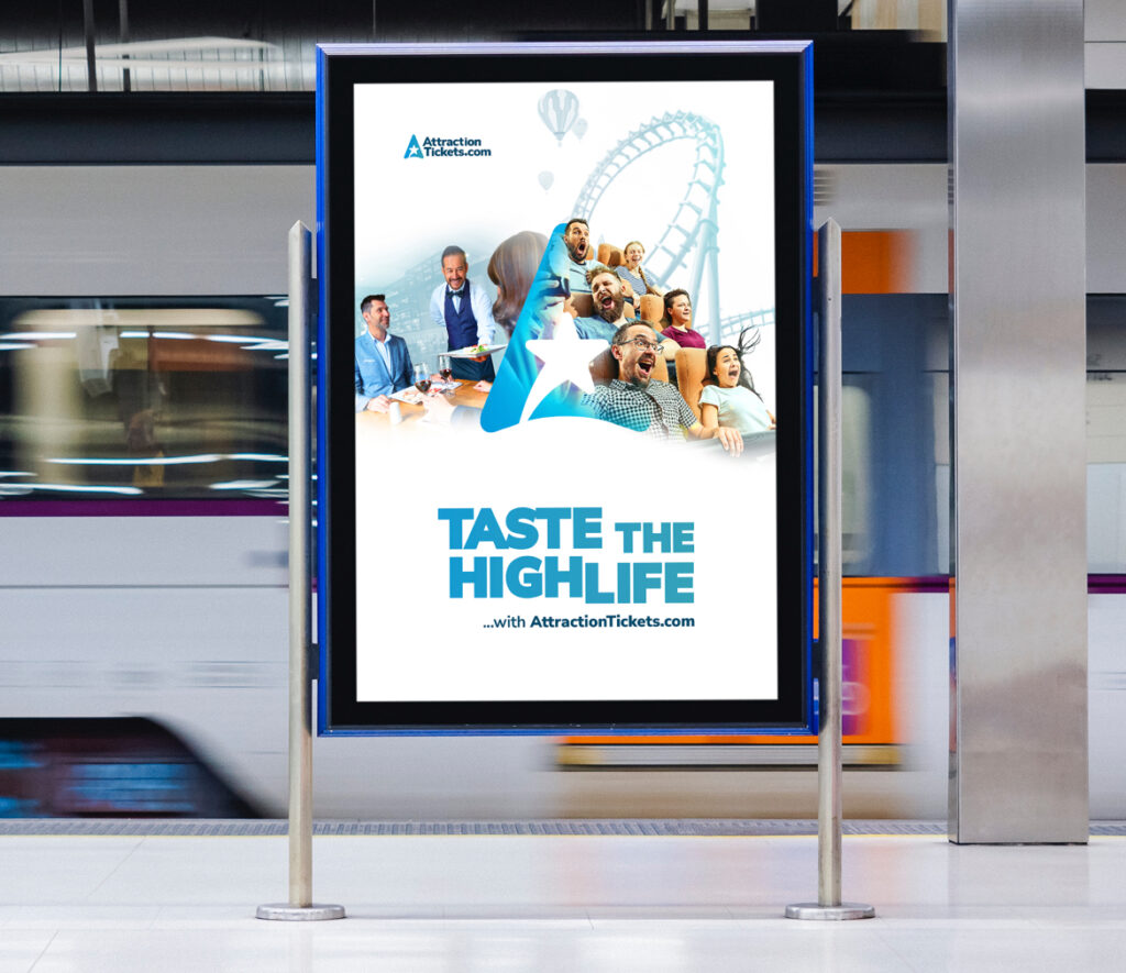
The imagery option 1
A juxtaposition of types of experience are placed together to elude to the range on offer at AttractionTickets.
The logo brand mark is placed front and centre, with images interacting with it as a focal point.
Background elements are coloured with tints of the brand blue, with the foreground imagery providing a pop of colour and energy.
The overall look is clean, with lots of white space to mimmick the website.

The imagery option 2
The second variation of the “Taste the highlife” theme also features emotive imagery of a romantic couple enjoying themselves, juxtaposed with the adrenaline rush kids are feeling as they take on a theme park ride… all the while, hot air balloons subtly and serenely drift into the distance.

Online and offline assets example 1


Online and offline assets example 2


