Part of my role as Head of Design at Tes, a global software and services provider for the education sector, was to develop and evolve their brand guidelines.
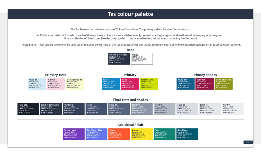
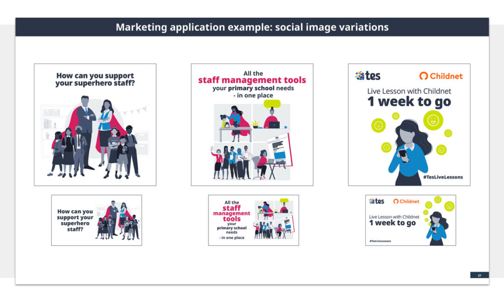
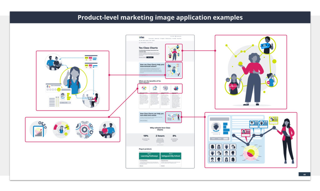
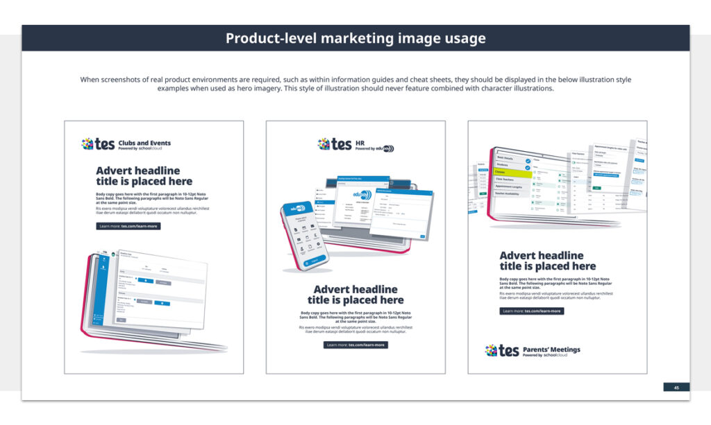
Below are examples from the slimmed-down, 47 page (from previously 80 pages 2 years prior) ‘interim’ brand guidelines document showing all of the usual content you’d expect, such as usage of logos, fonts, colours and the like.
This document served as a record of where Tes was at from a brand point of view, tidying up and reducing the amount of colours and application of imagery before the new style of illustrations were to be launched later in the year.
As with previous iterations, the rules for various templates across print and digital as well as the difference between brand and product marketing are still there, albeit simplified.


