
Making employee benefits feel more human
EmployeeChoice was a technology benefits service developed by Academia the Technology Group, enabling employees to purchase technology such as smartphones, laptops and headphones through a salary sacrifice scheme while benefiting from tax savings.
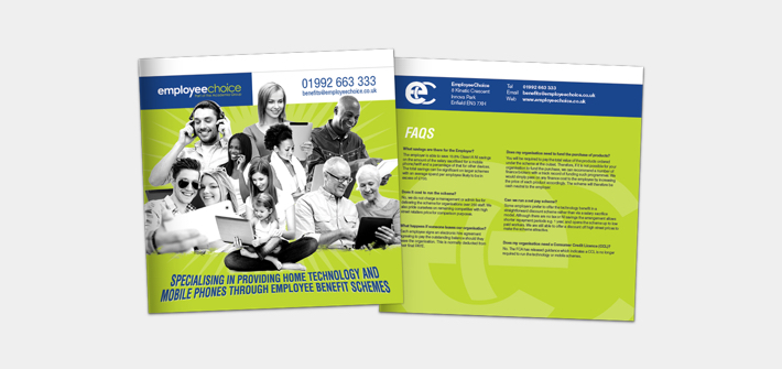
I was responsible for the design of the EmployeeChoice brand and its supporting marketing communications, including this brochure. The challenge was to take a subject that could easily feel functional, corporate and somewhat dry, and create a visual identity and communication style that felt modern, premium, approachable and genuinely appealing to both employers and employees.
Extending an established brand
As EmployeeChoice was part of Academia the Technology Group, it was important that the new brand felt connected to the wider business rather than appearing as a completely separate entity.
I therefore developed the identity as an extension of the existing Academia brand, retaining its established typography and core palette of blue, grey and white. A vibrant green was introduced as a distinctive secondary colour, giving EmployeeChoice its own personality and allowing it to stand apart while still feeling like a natural part of the wider organisation.
This created a flexible visual language that could be applied consistently across the EmployeeChoice brand and its marketing communications.
Bringing a dry subject to life
Employee benefits aren’t traditionally the most visually exciting subject matter, so a key part of the creative approach was to move away from the typical corporate imagery and overly technical language associated with the sector.
Rather than focusing solely on the technology itself, I used emotive lifestyle photography featuring people of different ages and ethnicities enjoying the products they could access through the scheme.
This helped shift the focus from the mechanics of salary sacrifice towards the more relatable benefit: giving people access to technology they actually want and enjoy using.
The resulting visual direction was clean, contemporary and aspirational, while remaining credible enough to appeal to HR and business decision-makers.
Making complex information easier to understand
The brochure needed to communicate a considerable amount of information — from how the scheme worked and its implementation process through to the benefits for employers and employees.
I used infographics, diagrams, structured layouts and visual hierarchy to break down potentially complex information into easily digestible sections.
Rather than allowing the brochure to become text-heavy, information was carefully structured so that readers could quickly understand the key points and then explore the detail if required.
Quotes and testimonials from businesses and employees were also incorporated to provide social proof and credibility, helping demonstrate the real-world value of the scheme.
Designing for two audiences
One of the key considerations was that the brochure needed to speak to two very different audiences.
For HR teams and employers, the communication needed to demonstrate the commercial and organisational benefits of introducing EmployeeChoice, while providing enough practical information to give them confidence in implementing the scheme.
For employees, the focus was much more emotional — highlighting the opportunity to access desirable technology while making the financial benefits of salary sacrifice easy to understand.
The design therefore balanced business credibility with consumer appeal, creating a piece of communication that could work across the entire decision-making journey.
The result
The final brochure combined a distinctive brand identity with editorial design, information graphics, photography and clear content structure to create a more engaging approach to employee benefits.
Rather than simply presenting the mechanics of a salary sacrifice scheme, the design positioned EmployeeChoice as a modern technology benefit that people could genuinely get excited about.
The project is a good example of my approach to design: taking complex or uninspiring subject matter, understanding the audience and commercial objective, and translating it into communication that is clear, engaging and visually compelling.
My role
Brand identity • Art direction • Graphic design • Editorial design • Information design • Infographics • Photography direction • Print production
Deliverables
EmployeeChoice brand identity • Marketing brochure • Information graphics • Customer communications


